Skip to content
Online store and company website. No cut of your revenue. Start for free.

How your online store can look

You start from one of 19 templates. Each changes how the store is laid out, not just its colours: how tall the homepage banner is, how many products sit side by side on a phone, how categories appear and which typeface the store uses.

Industry
Style

19 templates

Workshop and garden

Catalogue

  • Large catalogue
  • Practical
  • Minimal

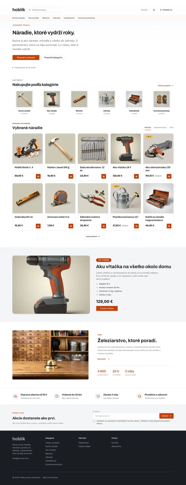
For a large range with specifications: a wide search bar in the header, a low banner with products straight away, small category squares, five columns of cards with a basket button, two products side by side on a phone and a dark footer.

What the template sets
Homepage banner
Low banner without a photo, products right below
On a phone
Two products side by side
Homepage categories
Small squares with a product photo, the name and the number of products
Product card
Framed card with a label and a basket icon next to the price
Header
Search on its own row, on a phone too
Product page
Photos and details side by side, description and specs in tabs
Homepage products
Tabs next to the headline above a grid of four or five columns
Footer
Dark footer with columns of links
Homepage section backgrounds
Each section with its own background
Content pages
Contact details one below another, pages in the basic layout
Shop benefits
Four benefits side by side, each with an icon tile
Newsletter field
Two columns on a soft panel, a frameless field next to the button
Featured product
Framed photo, checkmark list and original price
Articles on the homepage
Headline with a link to all articles, section and date above each headline
Story with a photo
Photo on the left, numbers in a row above a line
Section spacing
Standard spacing between homepage sections
Homepage headlines
Standard headlines
Typeface
Archivo for headings, Inter for text
Fashion and accessories

Shop window

  • Elegant
  • Minimal

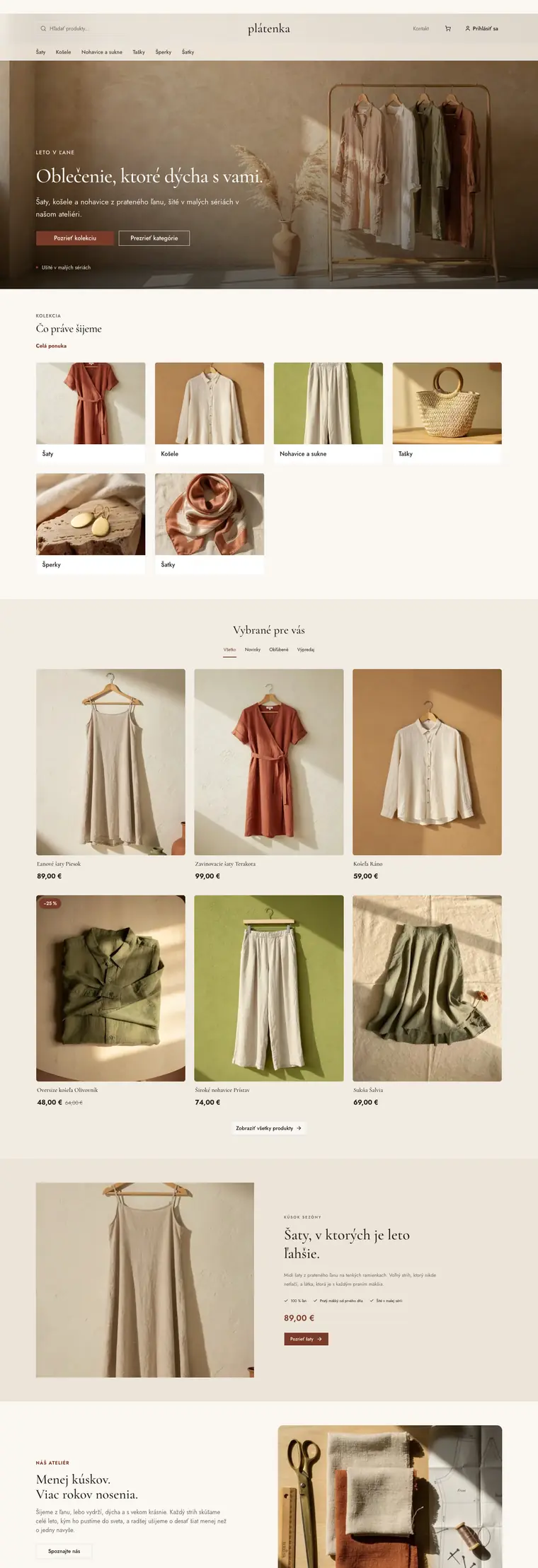
For fashion, accessories and jewellery that sell on looks: a centred logo, a full-width photo, large category tiles, airy product cards in tabs, a featured piece with a large photo and a dark footer.

What the template sets
Homepage banner
Full-width photo
On a phone
Two products side by side
Homepage categories
Large tiles with photos
Product card
Tall photo, no frame
Header
Logo in the centre
Product page
Larger photos one below another, price and button always in view
Homepage products
Product rows as tabs over one grid
Footer
Dark footer with columns of links
Homepage section backgrounds
Sections alternate white, grey and colour backgrounds
Content pages
Contact with a form beside the details, pages with a large photo and values in columns
Shop benefits
A slim row above a line, icon on the left
Newsletter field
Only a line under the e-mail field
Featured product
Large photo on the left, checkmark points in one row, price and button below
Articles on the homepage
Framed cards with section and date
Story with a photo
Text with numbers in boxes on the left, photo on the right
Section spacing
Spacious, 64 px above and below each section
Homepage headlines
Standard headlines
Typeface
Cormorant Garamond for headings, Jost for text

Crafts and handmade

Counter

  • Home and interiors
  • Beauty and cosmetics
  • Minimal
  • Elegant

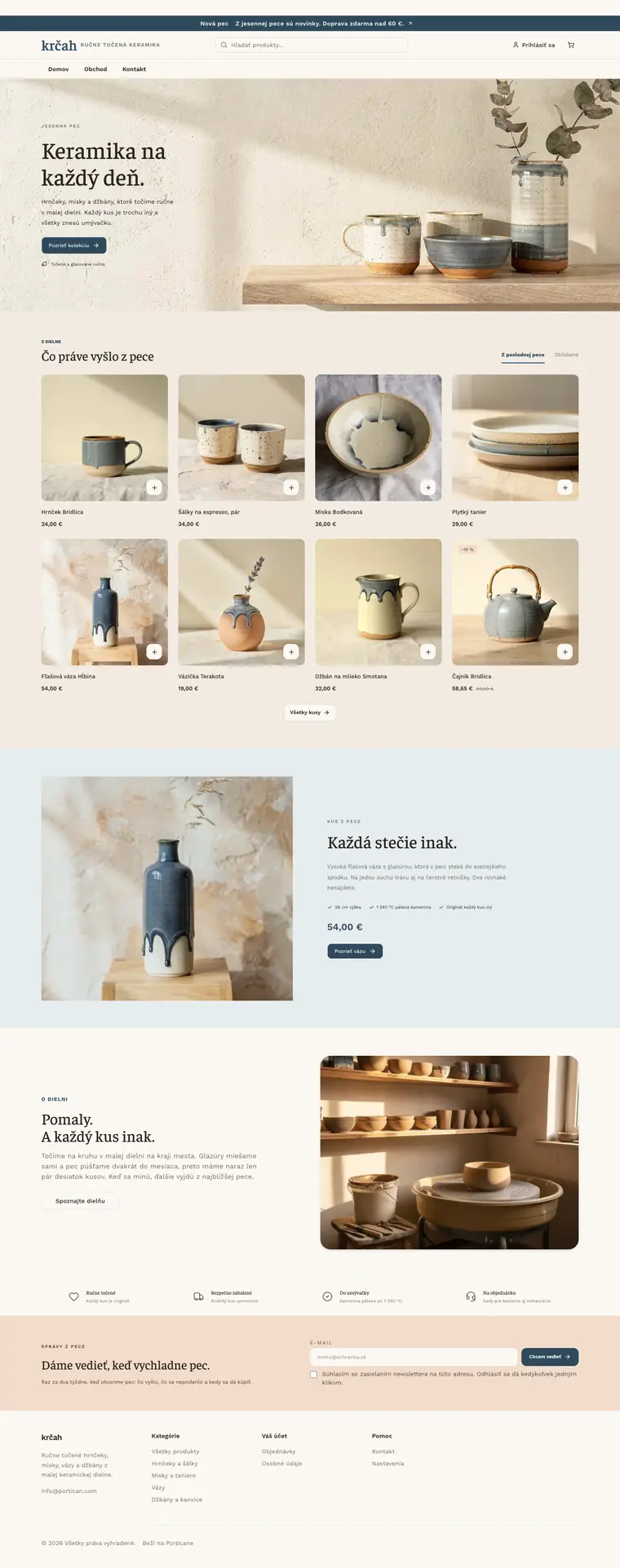
For a handful of products: a header with a menu, a light banner, products right under it with no categories, a single column of large cards on a phone, a featured piece with a large photo, a newsletter in the highlight colour and a warm typeface.

What the template sets
Homepage banner
Light photo with the text on the left, on a phone the text above the photo
On a phone
One product across the full width
Homepage categories
No categories, products right under the banner
Product card
Photo on a soft panel without a frame, a white square with a plus in the corner
Header
Announcement bar, centred search and a menu row below the logo
Product page
Larger photos one below another, price and button always in view
Homepage products
Tabs next to the headline above a grid of four or five columns
Footer
Light footer
Homepage section backgrounds
Sections alternate white, grey and colour backgrounds
Content pages
Contact with a form beside the details, pages with a large photo and values in columns
Shop benefits
A slim row above a line, icon on the left
Newsletter field
Two columns in the highlight colour, a frameless field next to the button
Featured product
Large photo on the left, checkmark points in one row, price and button below
Articles on the homepage
Headline with a link to all articles, section and date above each headline
Story with a photo
Text with numbers in boxes on the left, photo on the right
Section spacing
Spacious, 64 px above and below each section
Homepage headlines
Standard headlines
Typeface
Faustina for headings, Work Sans for text

Home and interiors

Home

  • Flowers and gifts
  • Elegant

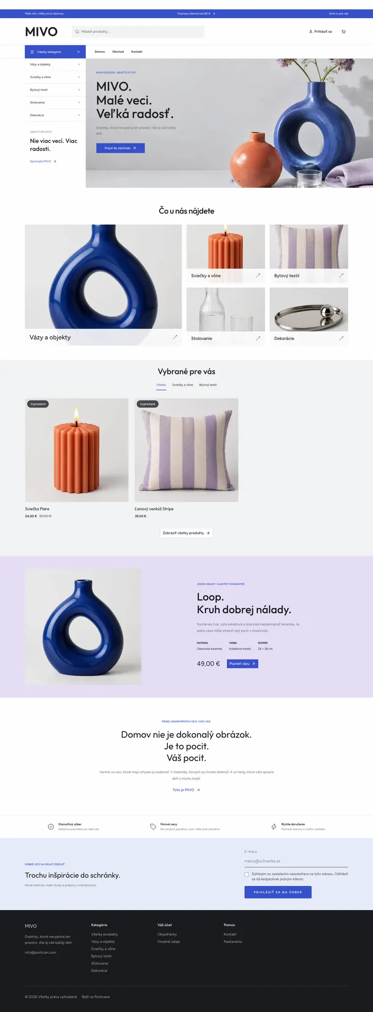
For home accessories, design and gifts: a header with all categories, a banner with slides, a category mosaic, products in tabs and a dark footer.

What the template sets
Homepage banner
Photo with slides, categories in a panel beside it
On a phone
Two products side by side
Homepage categories
Mosaic with one large tile
Product card
Square photo without a frame, label in the corner
Header
Announcement bar, wide search and a button with all categories
Product page
Photos and details side by side, description and specs in tabs
Homepage products
Product rows as tabs over one grid
Footer
Dark footer with columns of links
Homepage section backgrounds
Sections alternate white, grey and colour backgrounds
Content pages
Contact with a form beside the details, pages with a large photo and values in columns
Shop benefits
A slim row above a line, icon on the left
Newsletter field
Only a line under the e-mail field
Featured product
Photo with details in columns
Articles on the homepage
Photo and text without a frame
Story with a photo
Text with numbers in boxes on the left, photo on the right
Section spacing
Standard spacing between homepage sections
Homepage headlines
Standard headlines
Typeface
Outfit for headings, Figtree for text

Food and farms

Market

  • Bold

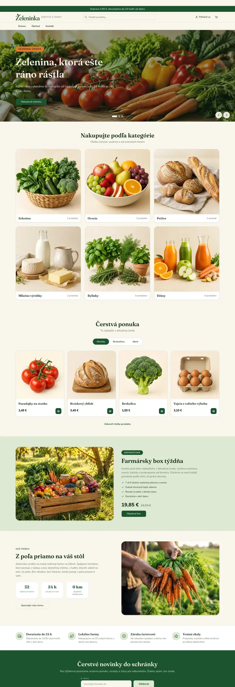
For fresh food, farms and bakeries: full-width slides, category cards, new arrivals, bestsellers and offers in a toggle, and a newsletter in your brand colour.

What the template sets
Homepage banner
Full-width slides with text on the photo
On a phone
One product across the full width
Homepage categories
Cards with a square photo and the number of products
Product card
Framed card with a label and a basket icon next to the price
Header
Announcement bar, centred search and a menu row below the logo
Product page
Photos and details side by side, tabs below on the left
Homepage products
Product rows as a pill switch above a four-column grid
Footer
Light footer
Homepage section backgrounds
Each section with its own background
Content pages
Contact details one below another, pages in the basic layout
Shop benefits
Four benefits side by side, each with an icon tile
Newsletter field
Section in the brand colour, field and button side by side
Featured product
Framed photo, checkmark list and original price
Articles on the homepage
Framed cards with section and date
Story with a photo
Text with numbers in boxes on the left, photo on the right
Section spacing
Standard spacing between homepage sections
Homepage headlines
Standard headlines
Typeface
Fraunces for headings, Nunito Sans for text

Electronics

Electro

  • Large catalogue
  • Practical
  • Bold

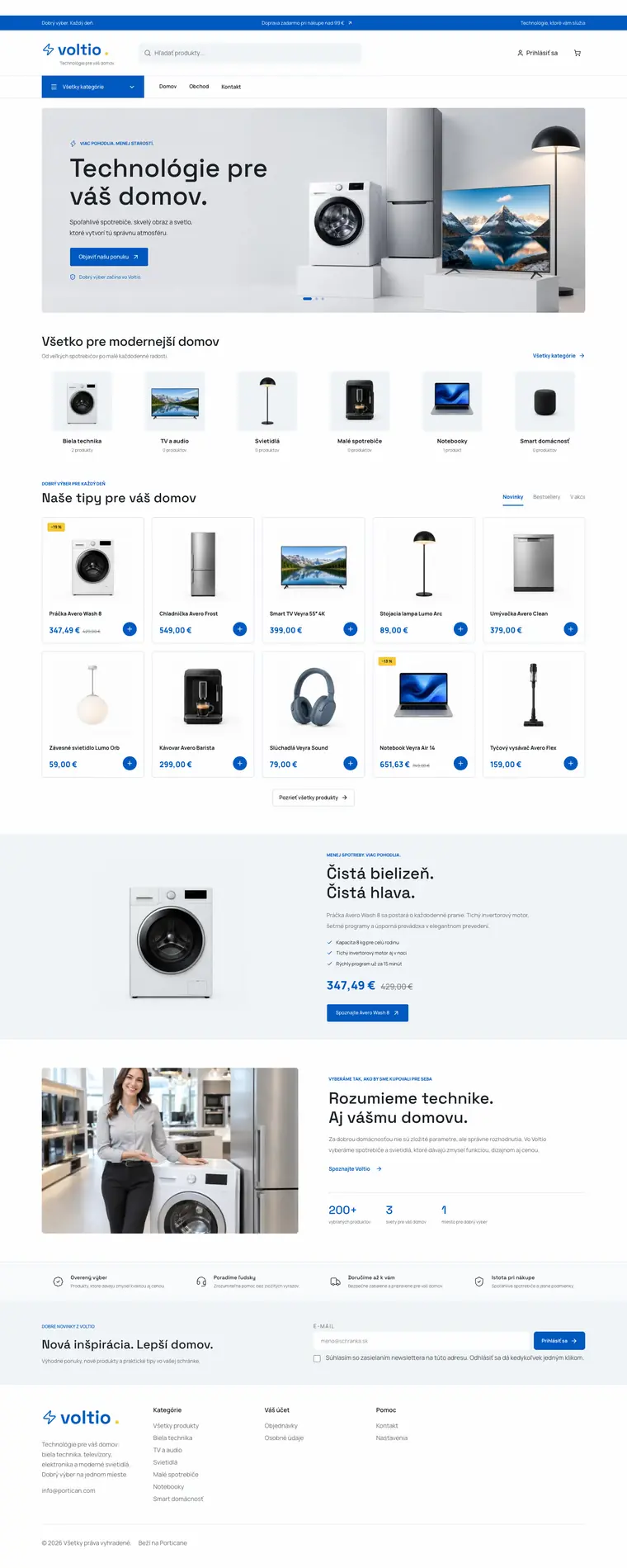
For electronics, appliances and lighting: a header with all categories, a framed banner, small category squares, five columns of cards with tabs and a story with numbers.

What the template sets
Homepage banner
Slides in a rounded frame, a light photo with dark text
On a phone
Two products side by side
Homepage categories
Small squares with a product photo, the name and the number of products
Product card
Outlined card, price in the brand colour and a round button
Header
Announcement bar, wide search and a button with all categories
Product page
Photos and details side by side, tabs below on the left
Homepage products
Tabs next to the headline above a grid of four or five columns
Footer
Light footer
Homepage section backgrounds
Each section with its own background
Content pages
Contact with a form beside the details, pages with a large photo and values in columns
Shop benefits
A slim row above a line, icon on the left
Newsletter field
Two columns on a soft panel, a frameless field next to the button
Featured product
Frameless photo, checkmark points and the price in the brand colour
Articles on the homepage
Headline with a link to all articles, section and date above each headline
Story with a photo
Photo on the left, numbers in a row above a line
Section spacing
Standard spacing between homepage sections
Homepage headlines
Standard headlines
Typeface
Space Grotesk for headings, Manrope for text

Kids and babies

Baby

  • Fashion and accessories
  • Playful

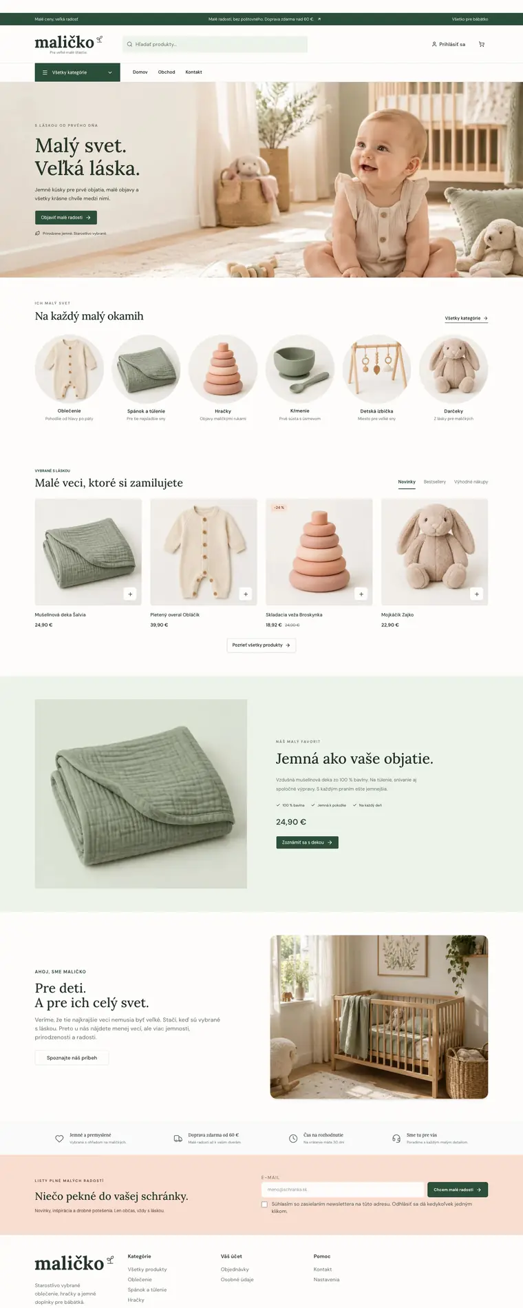
For baby clothes, toys and nursery goods: a light banner in soft colours, round category photos, frameless product cards, a featured product with a large photo, a newsletter in the highlight colour and spacious sections.

What the template sets
Homepage banner
Light photo with the text on the left, on a phone the text above the photo
On a phone
Two products side by side
Homepage categories
Round product photos with the name and a short description
Product card
Photo on a soft panel without a frame, a white square with a plus in the corner
Header
Announcement bar, wide search and a button with all categories
Product page
Photos and details side by side, tabs below on the left
Homepage products
Tabs next to the headline above a grid of four or five columns
Footer
Light footer
Homepage section backgrounds
Each section with its own background
Content pages
Contact with a form beside the details, pages with a large photo and values in columns
Shop benefits
A slim row above a line, icon on the left
Newsletter field
Two columns in the highlight colour, a frameless field next to the button
Featured product
Large photo on the left, checkmark points in one row, price and button below
Articles on the homepage
Headline with a link to all articles, section and date above each headline
Story with a photo
Text with numbers in boxes on the left, photo on the right
Section spacing
Spacious, 64 px above and below each section
Homepage headlines
Standard headlines
Typeface
Lora for headings, DM Sans for text

Fashion and accessories

Fashion

  • Kids and babies
  • Elegant
  • Minimal

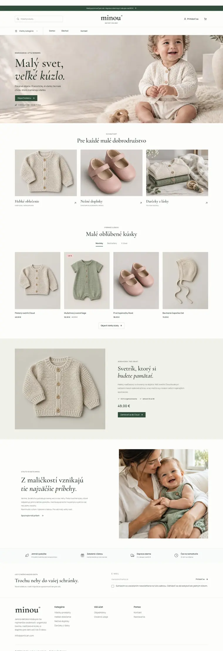
For fashion and boutiques: a header with the logo in the middle, a light banner, large category photos, cards with tall photos, editorial headlines in italics and a story with a large photo.

What the template sets
Homepage banner
Light photo with the text on the left, on a phone the text above the photo
On a phone
Two products side by side
Homepage categories
Large photos with the name, a short description and an arrow below
Product card
Tall photo on a soft panel, no frame or button
Header
Search on the left, logo in the middle, all categories and the menu below
Product page
Photos and details side by side, description and specs in tabs
Homepage products
Tabs next to the headline above a grid of four or five columns
Footer
Light footer
Homepage section backgrounds
Each section with its own background
Content pages
Contact with a form beside the details, pages with a large photo and values in columns
Shop benefits
A slim row above a line, icon on the left
Newsletter field
Two columns without a background, the field is just a line, the button is text
Featured product
Large photo on the left, checkmark points in one row, price and button below
Articles on the homepage
Headline with a link to all articles, section and date above each headline
Story with a photo
Text on the left, a large square photo on the right without a frame
Section spacing
Spacious, 64 px above and below each section
Homepage headlines
Larger centred headlines, second line in italics, tabs below the headline
Typeface
Cormorant Garamond for headings, Manrope for text

Beauty and cosmetics

Beauty

  • Elegant
  • Minimal

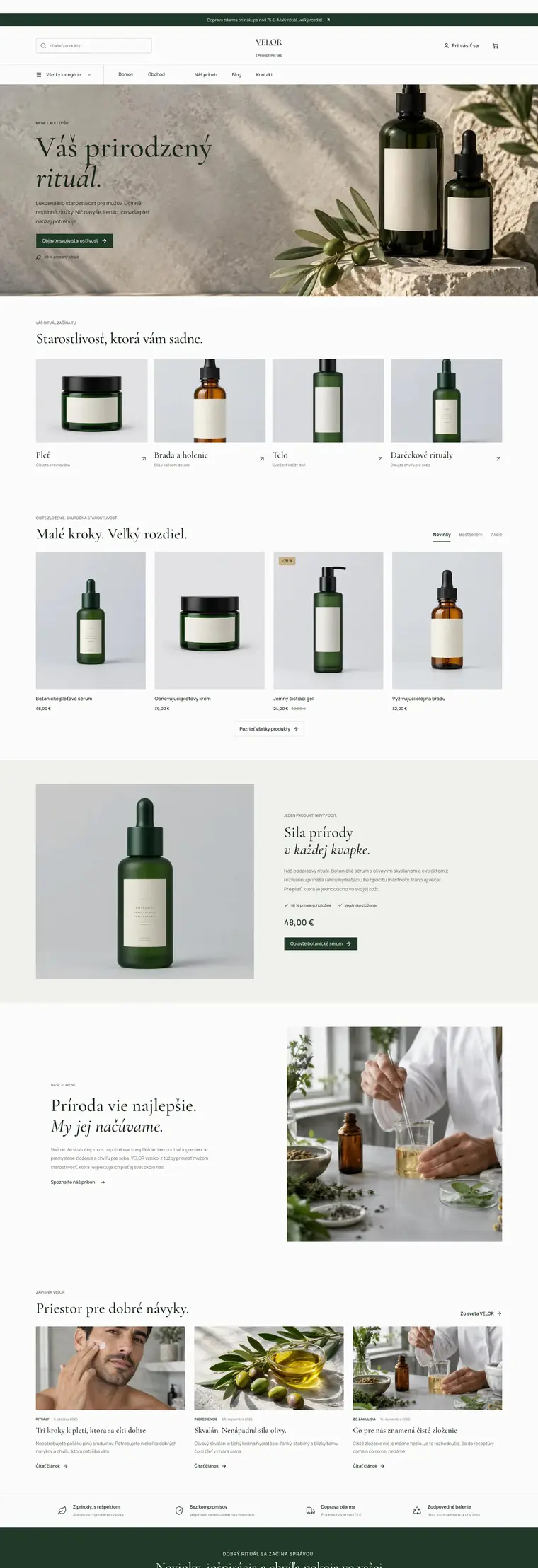
For cosmetics and care: a header with the logo in the middle, a light banner, four large category photos, cards with tall photos, left-aligned editorial headlines and a newsletter in the brand colour.

What the template sets
Homepage banner
Light photo with the text on the left, on a phone the text above the photo
On a phone
Two products side by side
Homepage categories
Large photos with the name, a short description and an arrow below
Product card
Tall photo on a soft panel, no frame or button
Header
Search on the left, logo in the middle, all categories and the menu below
Product page
Photos and details side by side, description and specs in tabs
Homepage products
Tabs next to the headline above a grid of four or five columns
Footer
Light footer
Homepage section backgrounds
Each section with its own background
Content pages
Contact with a form beside the details, pages with a large photo and values in columns
Shop benefits
A slim row above a line, icon on the left
Newsletter field
Section in the brand colour, field and button side by side
Featured product
Large photo on the left, checkmark points in one row, price and button below
Articles on the homepage
Headline with a link to all articles, section and date above each headline
Story with a photo
Text on the left, a large square photo on the right without a frame
Section spacing
Spacious, 64 px above and below each section
Homepage headlines
Larger headlines, a split headline has its second line in italics
Typeface
Cormorant Garamond for headings, Manrope for text

Books and publishing

Books

  • Elegant
  • Minimal

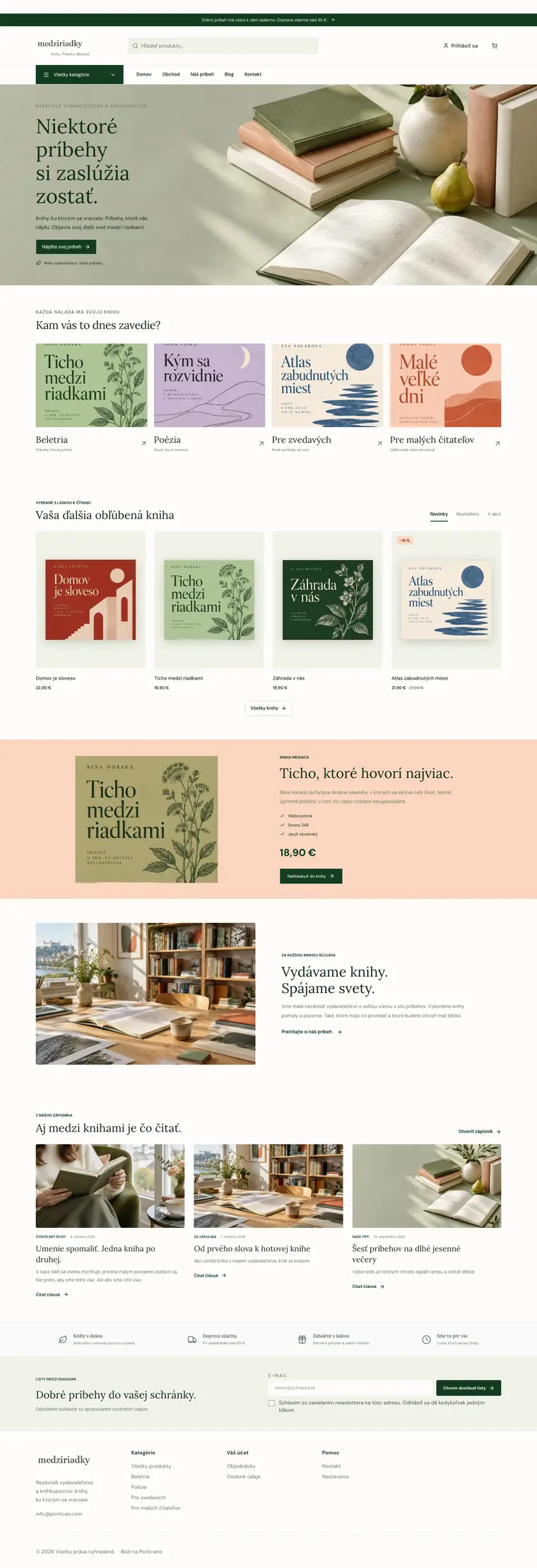
For bookshops and publishers: deep green with peach, bookish serif headlines, tall covers on a soft background and a book of the month on a peach band.

What the template sets
Homepage banner
Light photo with the text on the left, on a phone the text above the photo
On a phone
Two products side by side
Homepage categories
Large photos with the name, a short description and an arrow below
Product card
Tall photo on a soft panel, no frame or button
Header
Announcement bar, wide search and a button with all categories
Product page
Photos and details side by side, tabs below on the left
Homepage products
Tabs next to the headline above a grid of four or five columns
Footer
Light footer
Homepage section backgrounds
Each section with its own background
Content pages
Contact with a form beside the details, pages with a large photo and values in columns
Shop benefits
A slim row above a line, icon on the left
Newsletter field
Two columns on a soft panel, a frameless field next to the button
Featured product
Frameless photo, checkmark points and the price in the brand colour
Articles on the homepage
Headline with a link to all articles, section and date above each headline
Story with a photo
Photo on the left, numbers in a row above a line
Section spacing
Spacious, 64 px above and below each section
Homepage headlines
Standard headlines
Typeface
Lora for headings, DM Sans for text

Food and farms

Coffee

  • Elegant
  • Minimal

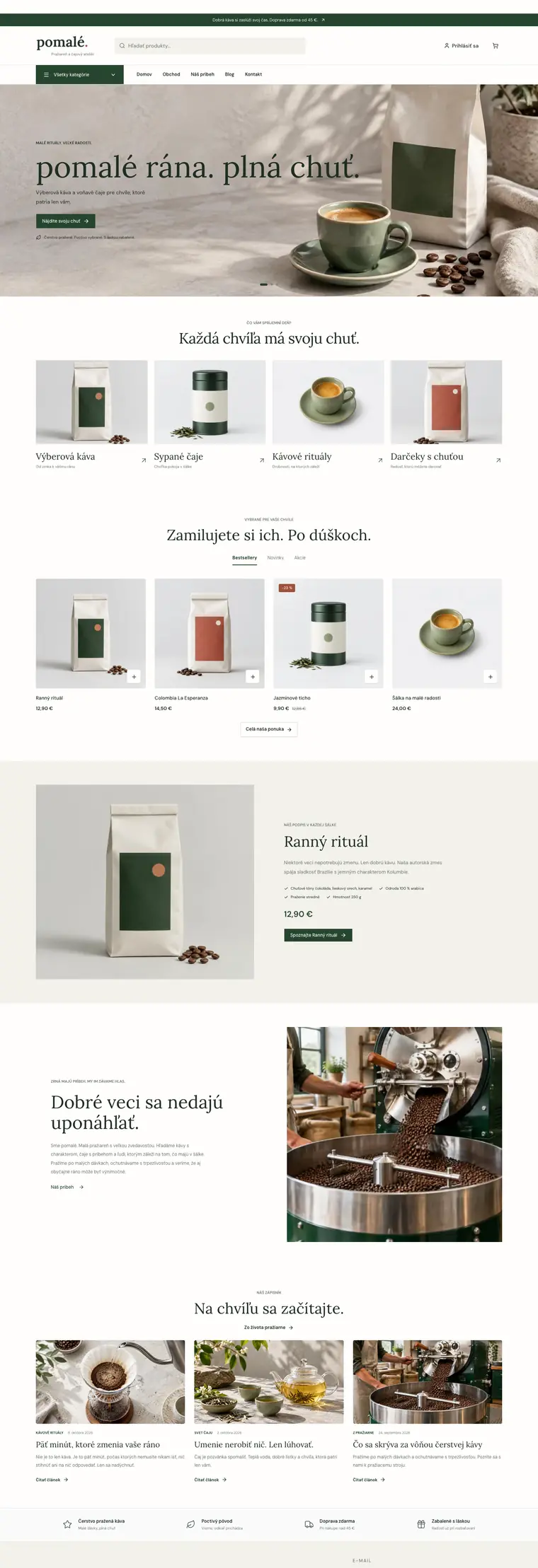
For coffee roasters, cafés and tea shops: deep green with terracotta, elegant centred serif headlines, large category photos and calm cards that let the packaging shine.

What the template sets
Homepage banner
Light photo with the text on the left, on a phone the text above the photo
On a phone
Two products side by side
Homepage categories
Large photos with the name, a short description and an arrow below
Product card
Photo on a soft panel without a frame, a white square with a plus in the corner
Header
Announcement bar, wide search and a button with all categories
Product page
Photos and details side by side, tabs below on the left
Homepage products
Tabs next to the headline above a grid of four or five columns
Footer
Light footer
Homepage section backgrounds
Each section with its own background
Content pages
Contact with a form beside the details, pages with a large photo and values in columns
Shop benefits
A slim row above a line, icon on the left
Newsletter field
Only a line under the e-mail field
Featured product
Large photo on the left, checkmark points in one row, price and button below
Articles on the homepage
Headline with a link to all articles, section and date above each headline
Story with a photo
Text on the left, a large square photo on the right without a frame
Section spacing
Spacious, 64 px above and below each section
Homepage headlines
Larger centred headlines, second line in italics, tabs below the headline
Typeface
Lora for headings, DM Sans for text

Sport and outdoor

Sport

  • Bold
  • Practical

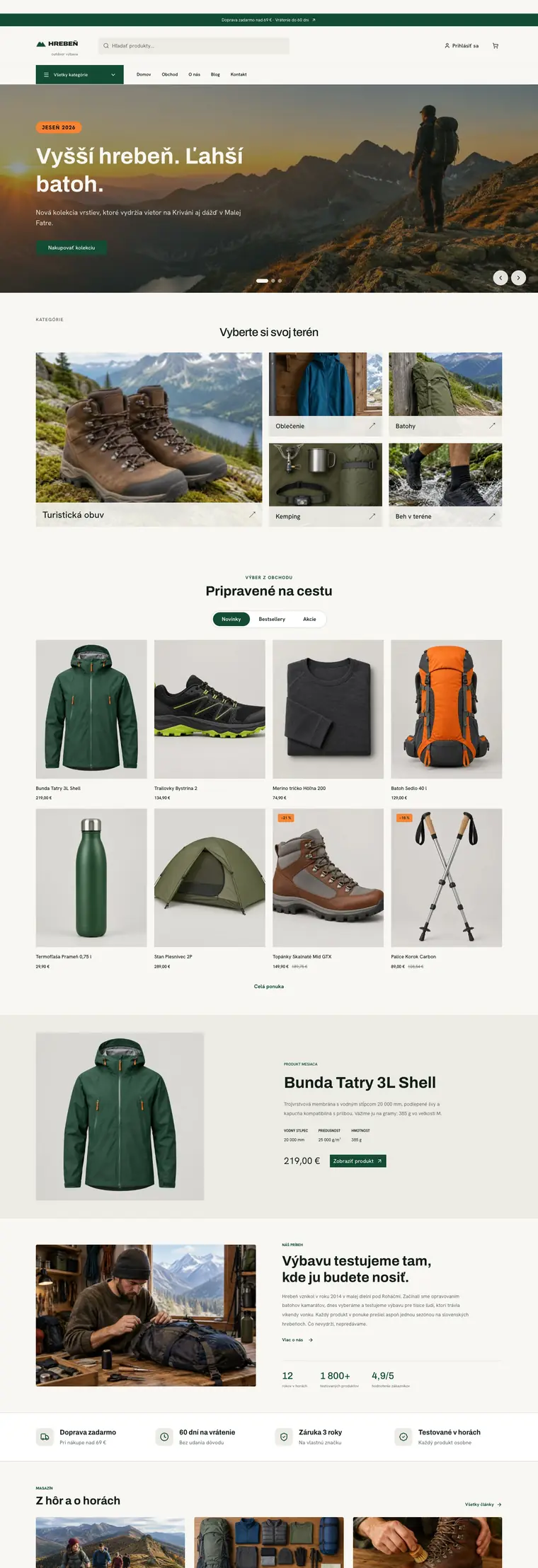
For sports and outdoor shops: forest green with orange, bold sans-serif headlines, dark slides on the homepage, a category mosaic with one large photo and a dark footer.

What the template sets
Homepage banner
Full-width slides with text on the photo
On a phone
Two products side by side
Homepage categories
Mosaic with one large tile
Product card
Tall photo on a soft panel, no frame or button
Header
Announcement bar, wide search and a button with all categories
Product page
Photos and details side by side, tabs below on the left
Homepage products
Product rows as a pill switch above a four-column grid
Footer
Dark footer with columns of links
Homepage section backgrounds
Each section with its own background
Content pages
Contact with a form beside the details, pages with a large photo and values in columns
Shop benefits
Four benefits side by side, each with an icon tile
Newsletter field
Two columns in the highlight colour, a frameless field next to the button
Featured product
Photo with details in columns
Articles on the homepage
Headline with a link to all articles, section and date above each headline
Story with a photo
Photo on the left, numbers in a row above a line
Section spacing
Spacious, 64 px above and below each section
Homepage headlines
Standard headlines
Typeface
Archivo for headings, Hanken Grotesk for text

Pet supplies

Pets

  • Playful
  • Practical

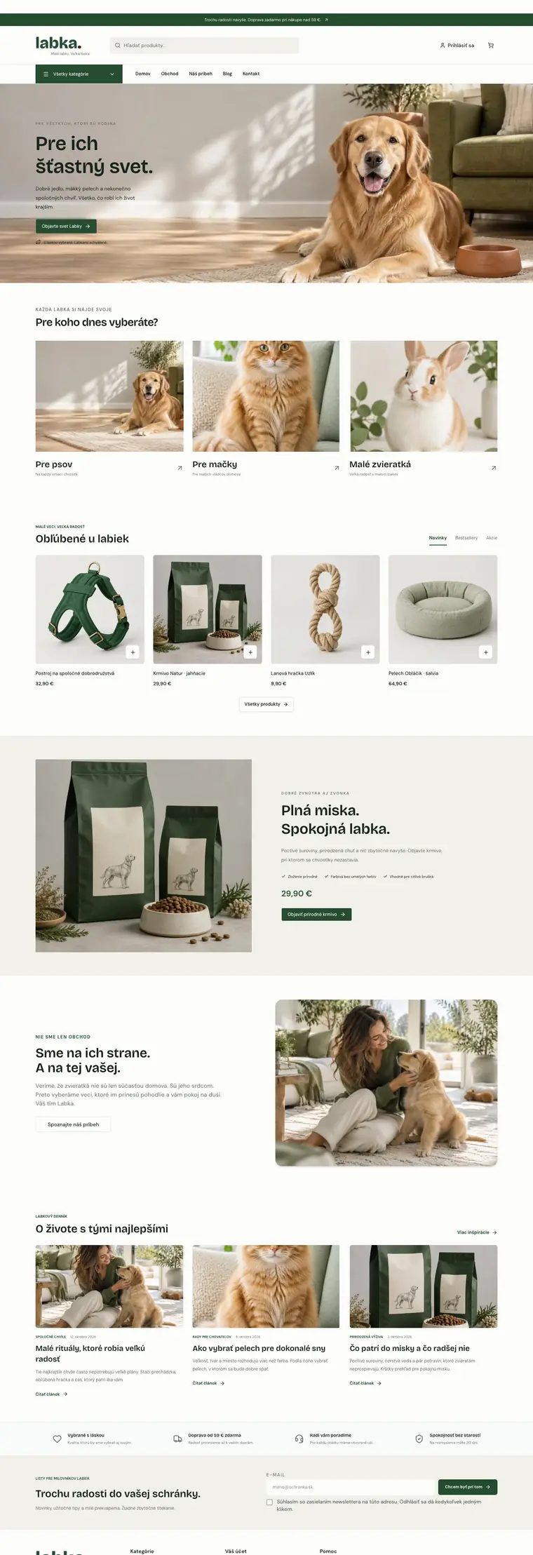
For pet shops: friendly green with soft apricot, a playful headline font, three large category photos and rounded cards on a soft background.

What the template sets
Homepage banner
Light photo with the text on the left, on a phone the text above the photo
On a phone
Two products side by side
Homepage categories
Large photos with the name, a short description and an arrow below
Product card
Photo on a soft panel without a frame, a white square with a plus in the corner
Header
Announcement bar, wide search and a button with all categories
Product page
Photos and details side by side, tabs below on the left
Homepage products
Tabs next to the headline above a grid of four or five columns
Footer
Light footer
Homepage section backgrounds
Each section with its own background
Content pages
Contact with a form beside the details, pages with a large photo and values in columns
Shop benefits
A slim row above a line, icon on the left
Newsletter field
Two columns on a soft panel, a frameless field next to the button
Featured product
Large photo on the left, checkmark points in one row, price and button below
Articles on the homepage
Headline with a link to all articles, section and date above each headline
Story with a photo
Text with numbers in boxes on the left, photo on the right
Section spacing
Spacious, 64 px above and below each section
Homepage headlines
Standard headlines
Typeface
Bricolage Grotesque for headings, DM Sans for text

Car and tyre service

Car repair

  • Bold
  • Practical

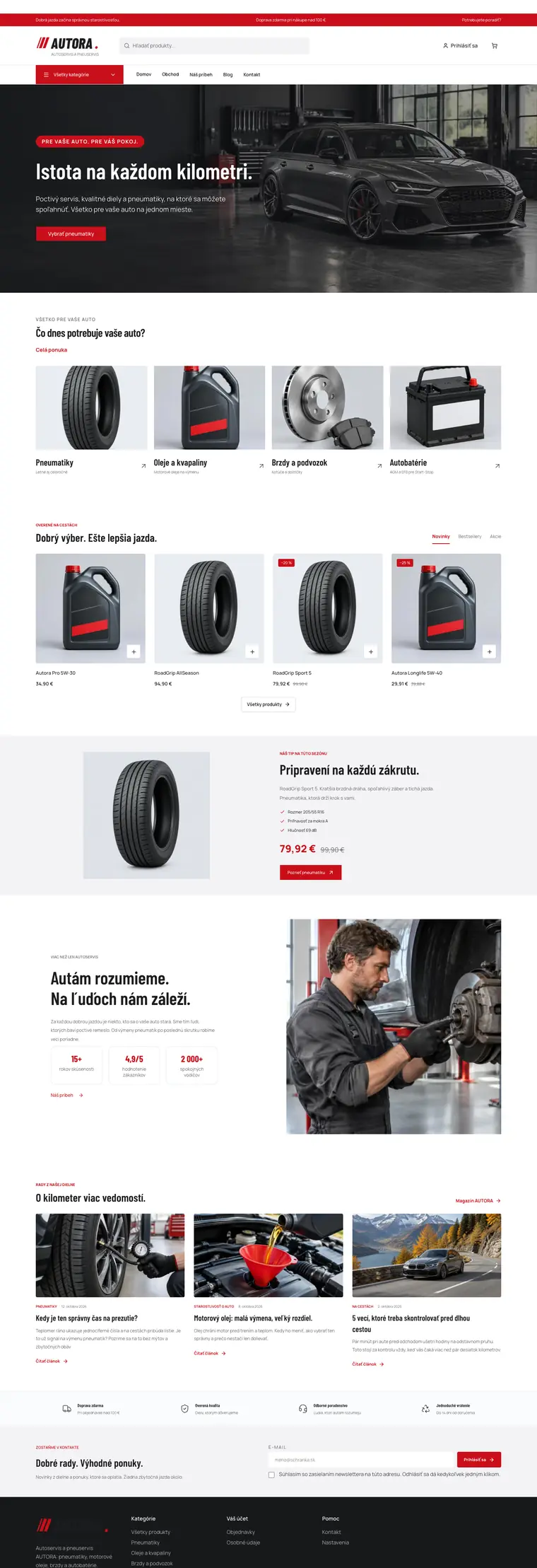
For car repair shops, tyre shops and car parts: white with red and black, condensed bold headlines, dark slides with white text, four large category photos and a dark footer.

What the template sets
Homepage banner
Full-width slides with text on the photo
On a phone
Two products side by side
Homepage categories
Large photos with the name, a short description and an arrow below
Product card
Photo on a soft panel without a frame, a white square with a plus in the corner
Header
Announcement bar, wide search and a button with all categories
Product page
Photos and details side by side, tabs below on the left
Homepage products
Tabs next to the headline above a grid of four or five columns
Footer
Dark footer with columns of links
Homepage section backgrounds
Each section with its own background
Content pages
Contact with a form beside the details, pages with a large photo and values in columns
Shop benefits
A slim row above a line, icon on the left
Newsletter field
Two columns on a soft panel, a frameless field next to the button
Featured product
Frameless photo, checkmark points and the price in the brand colour
Articles on the homepage
Headline with a link to all articles, section and date above each headline
Story with a photo
Text on the left, a large square photo on the right without a frame
Section spacing
Spacious, 64 px above and below each section
Homepage headlines
Standard headlines
Typeface
Barlow Condensed for headings, Manrope for text

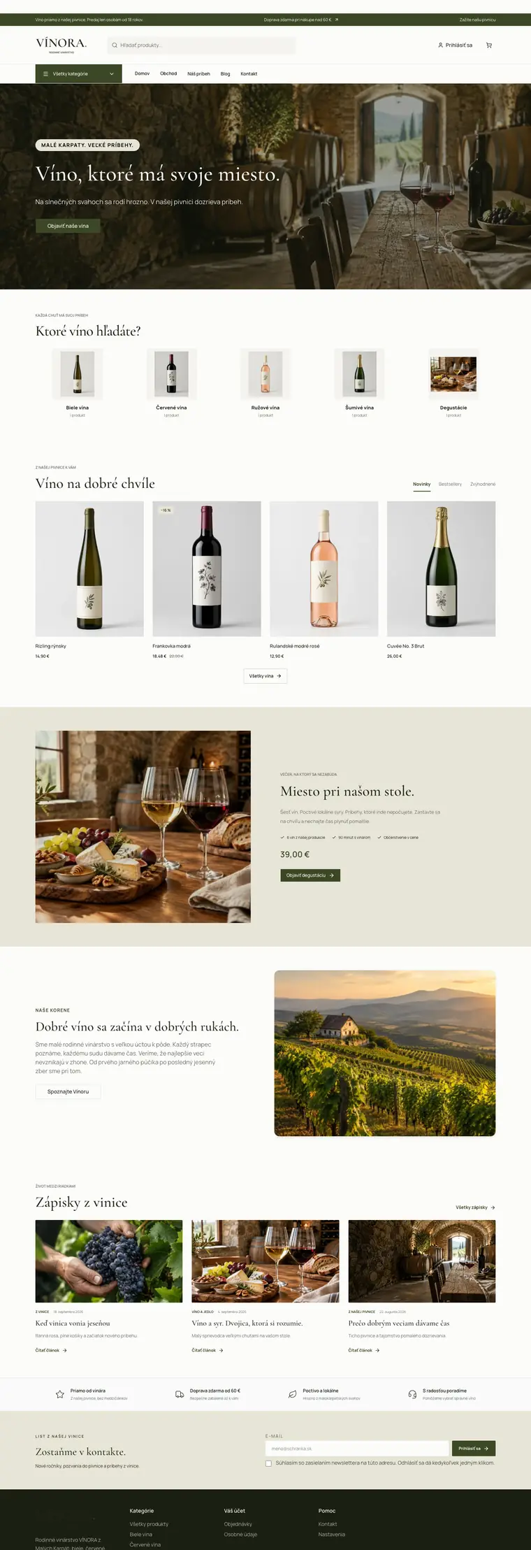
Winery

Winery

  • Food and farms
  • Elegant
  • Minimal

For wineries and wine shops: olive with cream, classic serif headlines, dark slides on the homepage, tall bottle photos on a soft background and a dark footer.

What the template sets
Homepage banner
Full-width slides with text on the photo
On a phone
Two products side by side
Homepage categories
Small squares with a product photo, the name and the number of products
Product card
Tall photo on a soft panel, no frame or button
Header
Announcement bar, wide search and a button with all categories
Product page
Photos and details side by side, tabs below on the left
Homepage products
Tabs next to the headline above a grid of four or five columns
Footer
Dark footer with columns of links
Homepage section backgrounds
Each section with its own background
Content pages
Contact with a form beside the details, pages with a large photo and values in columns
Shop benefits
A slim row above a line, icon on the left
Newsletter field
Two columns in the highlight colour, a frameless field next to the button
Featured product
Large photo on the left, checkmark points in one row, price and button below
Articles on the homepage
Headline with a link to all articles, section and date above each headline
Story with a photo
Text with numbers in boxes on the left, photo on the right
Section spacing
Spacious, 64 px above and below each section
Homepage headlines
Larger headlines, a split headline has its second line in italics
Typeface
Cormorant Garamond for headings, Manrope for text

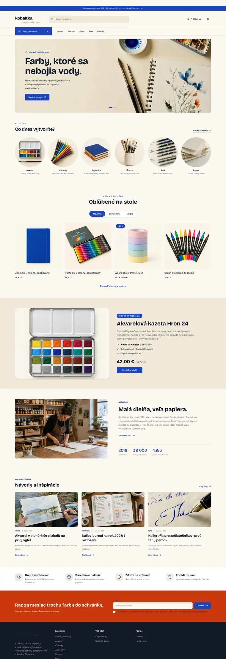
Crafts and handmade

Art supplies

  • Books and publishing
  • Playful
  • Bold

For art supplies and stationery: cobalt blue with vermilion on cream, playful bold headlines, slides in a rounded frame and round category photos.

What the template sets
Homepage banner
Slides in a rounded frame, a light photo with dark text
On a phone
Two products side by side
Homepage categories
Round product photos with the name and a short description
Product card
Square photo without a frame, label in the corner
Header
Announcement bar, wide search and a button with all categories
Product page
Photos and details side by side, tabs below on the left
Homepage products
Product rows as a pill switch above a four-column grid
Footer
Dark footer with columns of links
Homepage section backgrounds
Each section with its own background
Content pages
Contact with a form beside the details, pages with a large photo and values in columns
Shop benefits
Four benefits side by side, each with an icon tile
Newsletter field
Two columns in the highlight colour, a frameless field next to the button
Featured product
Framed photo, checkmark list and original price
Articles on the homepage
Headline with a link to all articles, section and date above each headline
Story with a photo
Photo on the left, numbers in a row above a line
Section spacing
Spacious, 64 px above and below each section
Homepage headlines
Standard headlines
Typeface
Bricolage Grotesque for headings, Figtree for text

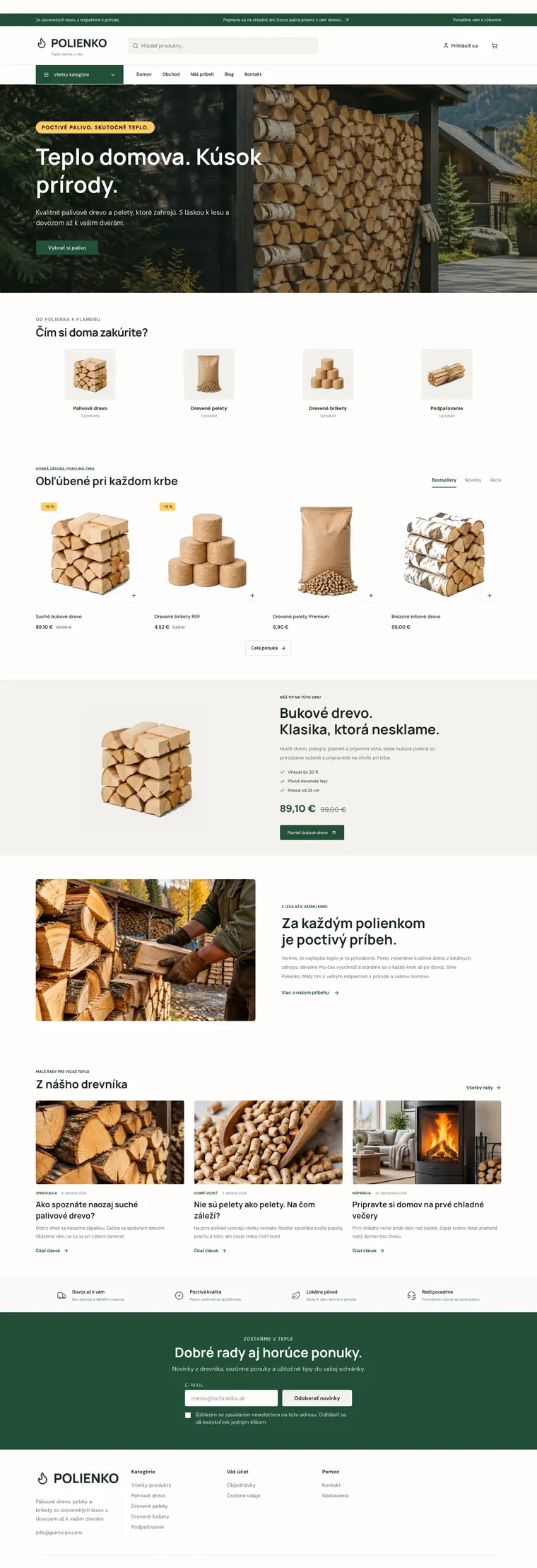
Firewood and pellets

Solid fuel

  • Practical

For firewood and pellets with delivery: forest green with warm yellow, bold headlines, a darkened photo with white text on the homepage and a newsletter in the brand colour.

What the template sets
Homepage banner
Full-width slides with text on the photo
On a phone
Two products side by side
Homepage categories
Small squares with a product photo, the name and the number of products
Product card
Photo on a soft panel without a frame, a white square with a plus in the corner
Header
Announcement bar, wide search and a button with all categories
Product page
Photos and details side by side, tabs below on the left
Homepage products
Tabs next to the headline above a grid of four or five columns
Footer
Light footer
Homepage section backgrounds
Each section with its own background
Content pages
Contact with a form beside the details, pages with a large photo and values in columns
Shop benefits
A slim row above a line, icon on the left
Newsletter field
Section in the brand colour, field and button side by side
Featured product
Frameless photo, checkmark points and the price in the brand colour
Articles on the homepage
Headline with a link to all articles, section and date above each headline
Story with a photo
Photo on the left, numbers in a row above a line
Section spacing
Spacious, 64 px above and below each section
Homepage headlines
Standard headlines
Typeface
Manrope for headings, DM Sans for text

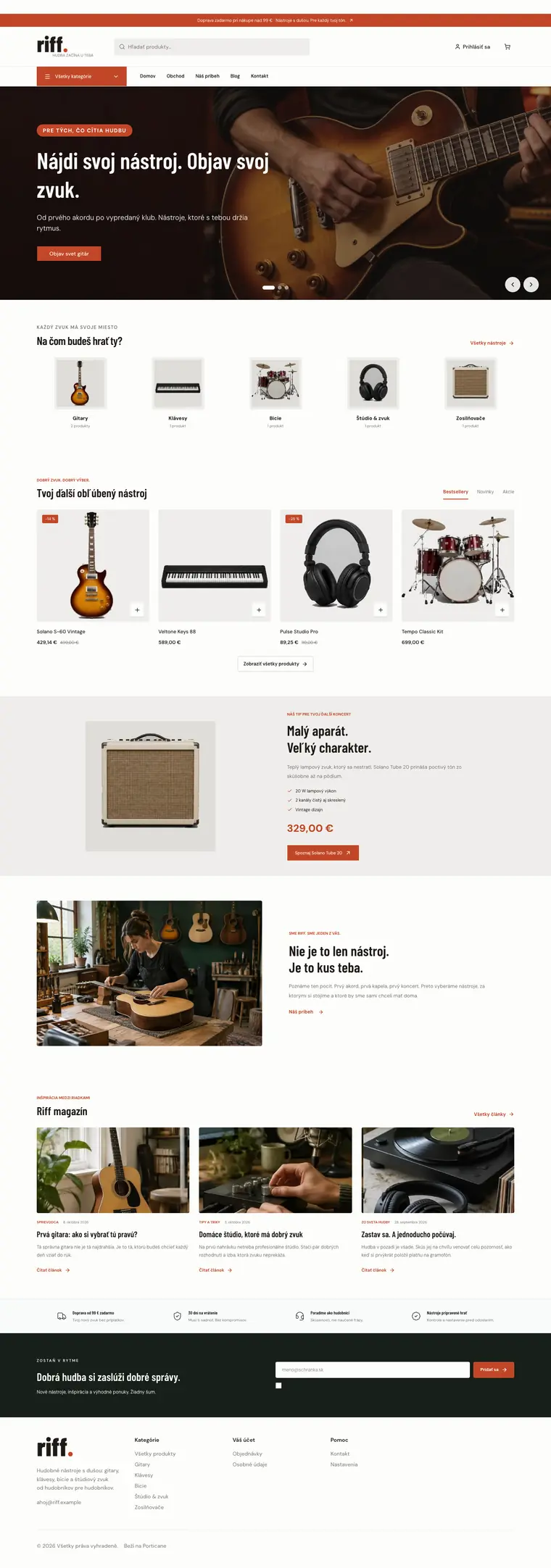
Music and instruments

Music

  • Bold
  • Practical

For music and instrument shops: brick red with black, condensed bold headlines, dark slides with white text and small category squares with product photos.

What the template sets
Homepage banner
Full-width slides with text on the photo
On a phone
Two products side by side
Homepage categories
Small squares with a product photo, the name and the number of products
Product card
Photo on a soft panel without a frame, a white square with a plus in the corner
Header
Announcement bar, wide search and a button with all categories
Product page
Photos and details side by side, tabs below on the left
Homepage products
Tabs next to the headline above a grid of four or five columns
Footer
Light footer
Homepage section backgrounds
Each section with its own background
Content pages
Contact with a form beside the details, pages with a large photo and values in columns
Shop benefits
A slim row above a line, icon on the left
Newsletter field
Two columns in the highlight colour, a frameless field next to the button
Featured product
Frameless photo, checkmark points and the price in the brand colour
Articles on the homepage
Headline with a link to all articles, section and date above each headline
Story with a photo
Photo on the left, numbers in a row above a line
Section spacing
Spacious, 64 px above and below each section
Homepage headlines
Standard headlines
Typeface
Barlow Condensed for headings, DM Sans for text

Health and pharmacy

Pharmacy

  • Beauty and cosmetics
  • Minimal
  • Practical

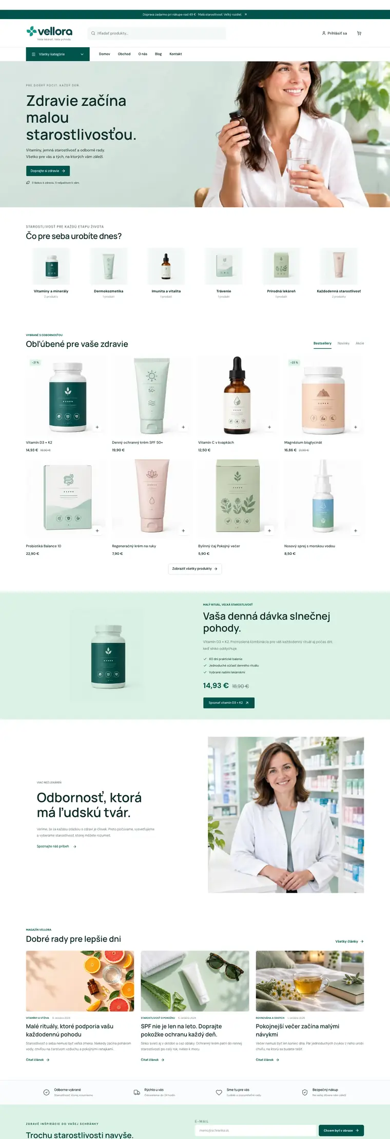
For pharmacies, supplements and skincare: clean white with deep teal and mint, six small category squares and a featured product on a mint band.

What the template sets
Homepage banner
Light photo with the text on the left, on a phone the text above the photo
On a phone
Two products side by side
Homepage categories
Small squares with a product photo, the name and the number of products
Product card
Photo on a soft panel without a frame, a white square with a plus in the corner
Header
Announcement bar, wide search and a button with all categories
Product page
Photos and details side by side, tabs below on the left
Homepage products
Tabs next to the headline above a grid of four or five columns
Footer
Light footer
Homepage section backgrounds
Each section with its own background
Content pages
Contact with a form beside the details, pages with a large photo and values in columns
Shop benefits
A slim row above a line, icon on the left
Newsletter field
Two columns in the highlight colour, a frameless field next to the button
Featured product
Frameless photo, checkmark points and the price in the brand colour
Articles on the homepage
Headline with a link to all articles, section and date above each headline
Story with a photo
Text on the left, a large square photo on the right without a frame
Section spacing
Spacious, 64 px above and below each section
Homepage headlines
Standard headlines
Typeface
Manrope for headings, DM Sans for text

We do not have a template for this combination yet. Try another industry or style.

The previews are screenshots of a sample store using the template, not drawings. Your store will show your own photos, texts and products. A demo is a sample store with made-up products: you can browse it and try the cart, but you cannot place an order.

You can change the template at any time

You choose a template when you create your store. Later you can switch it under Look and feel and bring back the previous look if you prefer it. A template does not touch your content: your texts, photos and products stay. The header, product page and typeface can also be set separately there.

Create your online store for free

Start with your store, not with technical worries.

Try Portican without a payment card and see whether it fits the way you sell. When you are ready, you connect your domain and choose a paid plan.

No card needed. The Free plan has no time limit.